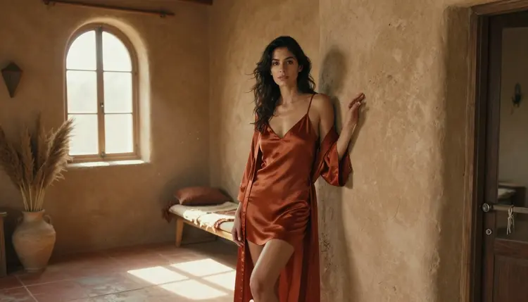
A single spicy portrait is easy to get right. A set of ten that all feel like they were shot in the same golden afternoon is a different problem, and it is one most people only notice after the images are already generated and nothing quite matches. The moment a shoot grows past one or two frames, small shifts in lighting, skin tone, and background color start to break the illusion that the whole set belongs together, and the fix is rarely more generations, it is a plan you set before the first prompt.
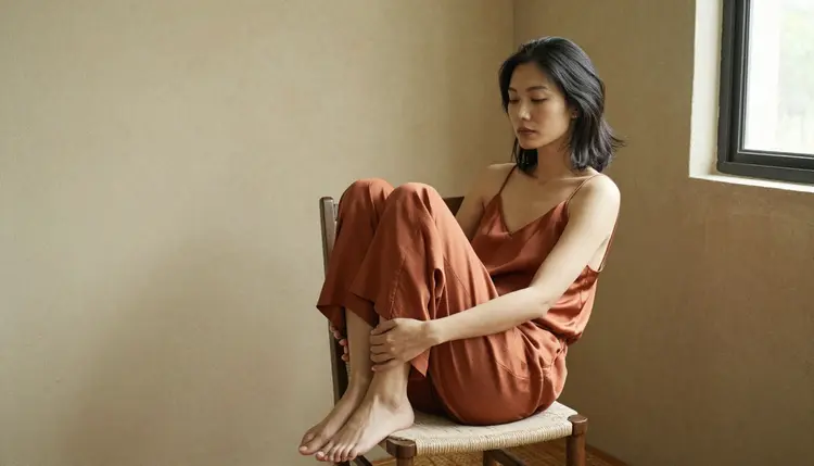
This guide walks through a repeatable way to lock an entire NSFW set to one reference palette, from choosing your anchor colors to writing prompts that hold them across every frame. It leans on Seedream 4.5, the Picasso IA model built for this kind of controlled, uncensored art direction, and shows where the rest of the filter-free lineup fits in when a set needs editing, motion, or a different rendering style.
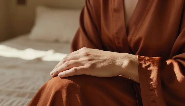
Whether the goal is a boudoir-style set, a character sheet, or a small gallery of intimate portraits, the method below scales from three images to thirty without the colors drifting frame by frame. It also travels well across formats: the same palette that holds a photoreal loungewear set together works just as reliably for an illustrated character sheet or a short video clip cut from the same shoot.
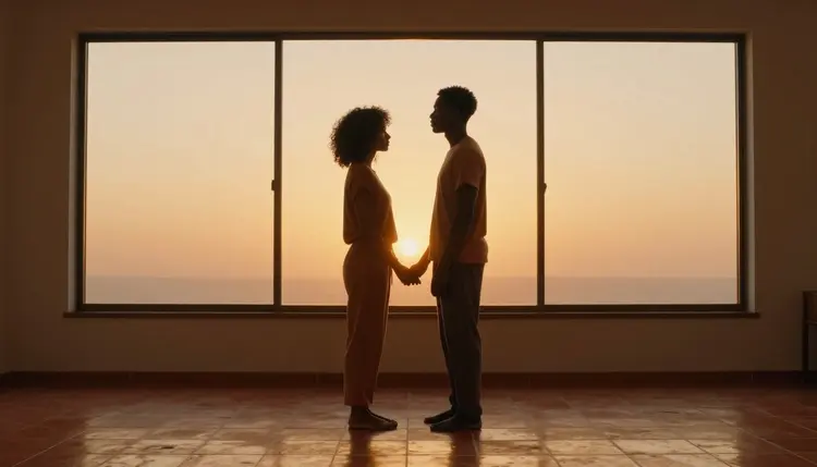
A palette is not a mood, it is a short list of colors you can point to. Before opening the generator, pull three to five anchor tones from a real source: a fashion editorial, a paint chip wall, a sunset photo, or a set of fabric swatches. Warm, earthy ranges like terracotta, rust, tan, amber, and cream read as intimate and sun-warmed, which is why they show up so often in boudoir and loungewear sets, but the same method works for cool blues, jewel tones, or a monochrome study just as well.
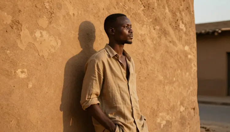
Write the palette down as a short list with rough hex values or plain color names, then keep it next to your prompt box for the whole session. Treat it like a client brief you are handing to yourself: nothing in the final set should need color correcting afterward if every prompt already pointed at the same five tones. It also pays to test the palette on one throwaway image first, since a phrase that sounds precise in your head can still render warmer or cooler than you expected once the model interprets it.
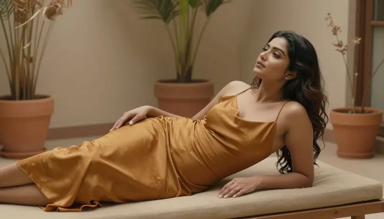
- Pick Three Anchor Colors. Choose one dominant tone, one supporting tone, and one accent, and write them down before you generate anything.
- Pull a Real Reference. Save a photo, fabric swatch, or paint sample that actually shows the colors so you are matching a source and not a memory.
- Name the Palette in Every Prompt. Repeat the same color words, in the same order, in each prompt so the model treats them as fixed instructions rather than loose suggestions.
- Match the Light to the Warmth. Pick one lighting condition, golden hour, lamp light, or soft window light, and use it across the whole set so shadows and highlights stay consistent.
- Check Every Frame Against the Set. Line the new image up next to the earlier ones before moving on, and regenerate anything that drifts before it becomes the odd one out.
Seedream 4.5 is the model to reach for first on Picasso IA when color control matters this much. It is one of the six models on the platform confirmed uncensored, with no content filter blocking the mature, intimate framing this kind of set needs, and it holds onto specific color instructions across a whole batch more reliably than general-purpose models that were never built for adult art direction. In practice that means fewer regenerations per set, since a palette stated once in the prompt tends to survive into the next frame instead of quietly sliding toward a generic warm-toned default.
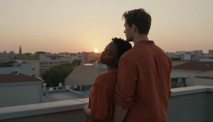
It is not the only option worth knowing. Qwen Image 2 and Recraft V4.1 Pro are also confirmed filter-free and worth trying when a set calls for a different rendering style on the same palette, a more illustrative look from Recraft V4.1 Pro or a photoreal alternative from Qwen Image 2. If a single frame needs a color tweak after the fact rather than a full regeneration, Picasso Image Editor Pro is the uncensored editor built for exactly that kind of touch-up, and it is often faster than starting a frame over from scratch.
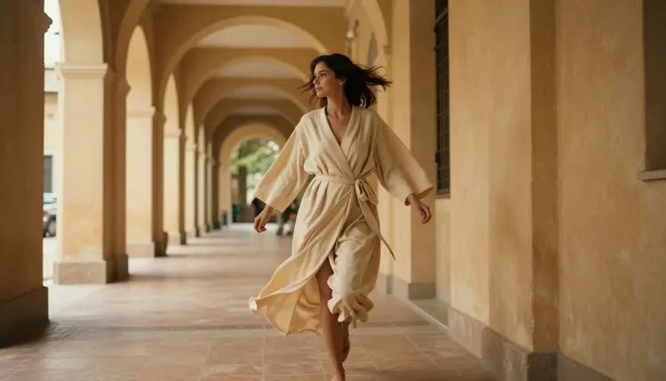
Front-load the palette. Open the prompt with the color list itself, for example terracotta and rust tones, cream and tan fabric, warm adobe walls, before describing the scene, the subject, or the pose. Models weigh earlier words more heavily than later ones, so a palette buried at the end of a long prompt is far more likely to drift than one stated first, especially across a long generation session.
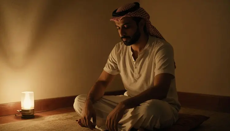
Keep the lighting description tied to the palette rather than generic. Warm lamplight reads differently to the model than soft lighting, and it reinforces the same warm range instead of leaving the tone up to chance. Reuse the exact wording, not a synonym, across every prompt in the set, since small phrasing changes are often what causes the color drift you are trying to avoid in the first place.
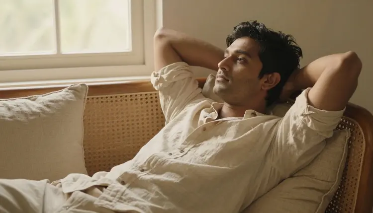
A working template looks like this: state the palette first, name the subject and pose second, name the setting third, and close with the lighting phrase, repeated word for word across the set. Once that order earns you a first image you like, changing only the pose or the setting between prompts is usually enough to build out the rest of the gallery without losing the palette.
Everything generated through Picasso IA in this category is 18+ and intended for adults only, and the tools assume that audience by default. Every person shown in these images is a fictional adult character generated from a text prompt, never a real, identifiable person without their consent, and the platform does not generate minors under any framing or prompt wording, no exceptions. Generations and the prompts behind them stay private by default on Picasso IA and are not shared publicly or used to identify anyone.
The most common failure is switching lighting language mid-set. A prompt that asks for golden hour on frame one and soft window light on frame four will produce two different color temperatures even with the same palette words repeated in both, so pick one lighting phrase for the whole set and repeat it exactly.
Vague color words are the second issue. Warm tones leaves too much room for the model to wander from frame to frame, while terracotta, rust, and cream gives it something concrete to hold onto across every generation in the batch, including the ones you generate days apart.
The third mistake is skipping the side by side check. Small drift is nearly invisible one image at a time and only becomes obvious once four or five sit next to each other, so build in a comparison step before calling the set finished rather than after it ships.
The fourth is changing models partway through a set without carrying the palette wording over. Each model interprets color language a little differently, so when a frame moves from Seedream 4.5 to Picasso Image Editor Pro for a touch-up, keep the same color words in the edit instructions rather than describing the palette in new terms.
What does matching a reference palette actually mean for NSFW AI art?
It means every image in a set shares the same small group of colors, from skin tones to fabric to background, so the pieces read as one coherent shoot instead of a random mix of unrelated generations made on different days.
Which Picasso IA model handles palette matching best?
Seedream 4.5 is the strongest fit for this kind of work. It is a confirmed uncensored model that holds specific color instructions consistently across a full batch of intimate or mature images without needing constant correction.
Can I upload my own reference photo to set the palette?
Yes, a reference photo, fabric swatch, or mood board works well as a starting point. Translate the colors you see into plain words or hex values and repeat them in every prompt rather than relying on the model to infer them from the image alone.
Do I need to describe every single color in the prompt?
No, three to five anchor colors are enough for most sets. Naming a dominant tone, a supporting tone, and an accent gives the model a clear target without crowding the prompt so much that other important details get lost.
How do I keep skin tones consistent under a warm palette?
Tie the skin tone description to the same light source used for the rest of the scene, such as warm lamplight or golden hour, since consistent lighting language does more to unify skin tones across a set than adjusting the skin description alone.
Can Qwen Image 2 or Recraft V4.1 Pro also hold a color palette?
Yes, both are confirmed filter-free models worth using alongside Seedream 4.5 when a set needs a different rendering style, a more illustrative look from Recraft V4.1 Pro or a photoreal alternative from Qwen Image 2, while keeping the same palette wording throughout.
Is it possible to turn a palette-matched image into a short video?
Yes, LTX 2.3 Pro and Picasso Video are the confirmed uncensored options for turning a still into motion, and carrying the same color and lighting words into the video prompt keeps the finished clip in line with the rest of the set.
Who is allowed to use the uncensored models on Picasso IA?
These tools are restricted to adult users generating fictional, adult content only. Every session assumes an 18+ audience, and the platform does not produce content involving minors under any prompt or framing, without exception.
Are the people shown in these example images real?
No, every figure shown across this guide is a fictional character generated from a text prompt for illustration purposes only. Picasso IA does not generate real, identifiable people without their explicit consent.
Will my prompts and generated images stay private?
Yes, generations and the prompts used to create them are private by default on a Picasso IA account and are not published or shared with anyone unless the account holder chooses to do so.