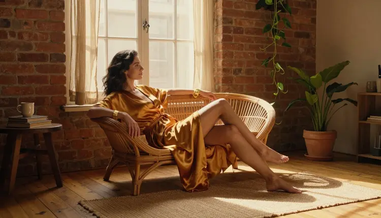
Ask ten people what makes an AI portrait feel intimate and nine of them will talk about pose, outfit or camera angle. Almost nobody mentions color, yet color is doing half the emotional work before a viewer even registers what the subject is wearing. A cobalt blue robe at dusk reads as cool, private and a little mysterious. The same pose lit in warm rust and candlelight reads as close and inviting. Swap one palette for another and the same prompt produces a completely different mood, even when every other word stays untouched.
This guide walks through ten color directions worth testing on Picasso IA, a five step method for locking a palette into your own prompts so it stops being a lucky accident, which models actually hold color and skin tone steady across a whole shoot, the mistakes that wash a palette out before it ever renders, and the house rules every adult creator on this platform works inside. Everything below assumes fictional adult subjects, tasteful framing and a tool built for adults, not a workaround for anything more graphic.
Pose and wardrobe tell a viewer what is happening. Color tells them how to feel about it before they have consciously read either one. Warm, low saturation light (candle amber, rose gold, dim tungsten) reads as private and unhurried. Cool, high contrast light (blue hour, moonlight, cold studio white) reads as composed and a little distant. Neither is more flattering than the other, they just aim at a different mood, and mixing the two in one shot is usually what makes a render feel confused rather than layered.
Skin tone is the part most people forget to protect. A palette that leans too far into one hue, deep blue or heavy amber, will tint skin along with everything else unless the prompt or the model corrects for it. That is why the strongest palettes on this list separate the environment color from the skin tone instruction instead of letting one bleed into the other.
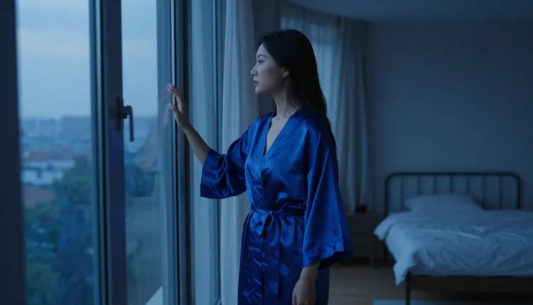
The cobalt blue robe above is a clean example of a cool palette that still reads as warm in tone: the light is blue, the skin is protected, and the mood lands as intimate rather than cold. That balance, one dominant color plus one protected element, is the whole trick behind every palette in this guide.
You do not need a color theory degree to make a palette repeat itself reliably. You need five decisions made once and then reused, in this order, every time you write a prompt.
- Pick One Dominant Hue. Choose a single color family, cobalt, rust, burgundy, rose gold, and name it first in the prompt so the model treats it as the priority instead of a suggestion.
- Set the Saturation Ceiling. Decide whether the palette is soft and pastel or deep and saturated, then describe that intensity directly instead of leaving it to chance.
- Choose a Skin Tone Anchor. Write the skin tone as its own instruction, separate from the environment color, so the dominant hue does not tint it.
- Add One Accent Color. A single accent, gold trim, a green plant, a silver ring, keeps a palette from going flat without competing with the dominant hue.
- Lock It Into a Reusable Prompt Block. Save the hue, saturation ceiling, skin anchor and accent as one phrase you paste into every prompt for that character or shoot.
Run the same five decisions across a whole shoot and every image comes out feeling like it belongs to the same story, even when the pose, outfit and setting change from frame to frame.
Once the method is set, the fastest way to find a signature look is to test a handful of proven directions and see which one fits the character you are building.
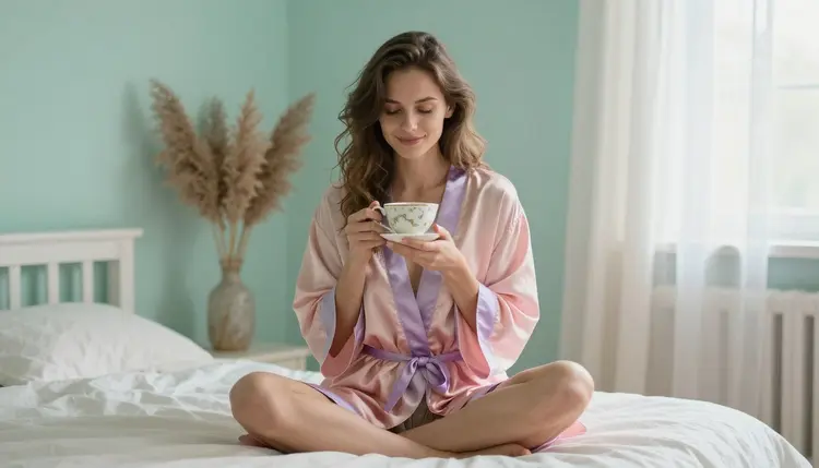
Pastel pink and lavender is the softest entry on this list, low saturation, high key light, and it reads as playful and unguarded rather than moody. It works especially well for morning or at home settings, a teacup, a cushion, natural window light.
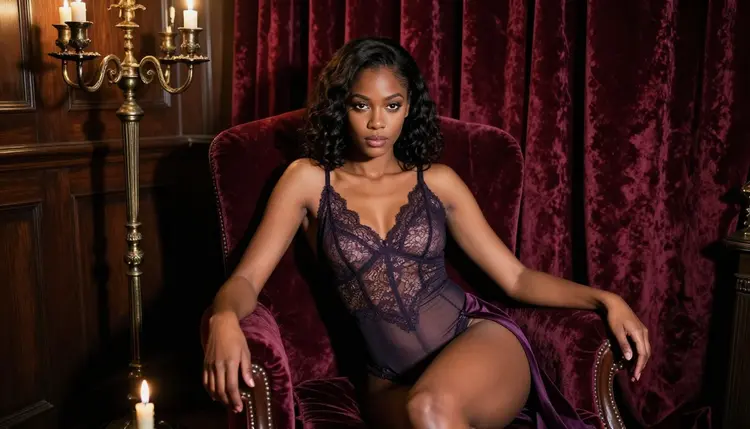
Burgundy velvet and candlelight sits at the opposite end: deep saturation, warm point light sources, heavy shadow. It is the palette to reach for when the scene needs to feel deliberate and a little theatrical rather than casual.
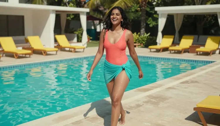
Coral against bright daylight water is the palette for movement and lightness, laughter caught mid frame instead of a held pose. Saturation stays high but the light is flat and even, which keeps the mood easy rather than intense.
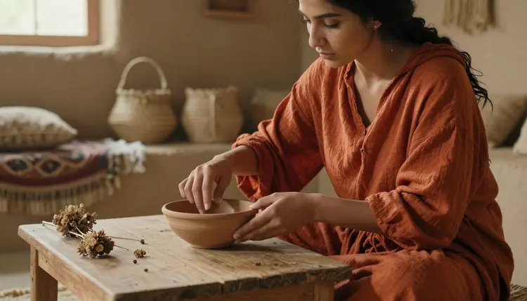
Rust orange and clay is an underused palette outside of food and interiors photography, but it translates beautifully to a portrait: earthy, tactile, warm without tipping into red. Pair it with natural materials, linen, wood, unglazed ceramic, for the strongest result.
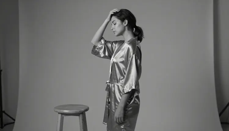
Silver satin against a bare studio background is the palette for when the fabric itself should be the subject. Keep the backdrop close to neutral grey so nothing competes with the way the satin catches light, and let a hard single light source do the rest.
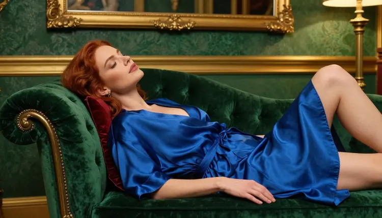
Blue silk on emerald velvet is a complementary pairing, blue and green sit next to each other on the wheel but read as jewel toned together rather than clashing, especially under warm point light that keeps both from turning cold.
Beyond these six, four more directions are worth keeping in your back pocket: charcoal grey with a single gold accent for a nighttime, editorial feel, monochrome sepia for an intentionally vintage look, soft sage green with natural wood for an outdoor, unstaged mood, and warm black with a single red accent for the most saturated end of the spectrum. Ten starting points, one method, and a character that can move between all of them without losing its identity.
Not every model renders a palette the way you typed it. Some tools shift warm tones toward orange, others crush shadow detail the moment saturation climbs, and a few will not hold a consistent skin tone across more than two or three generations in a row.
Seedream 4.5 and Recraft V4.1 Pro are the most reliable starting points for the softer palettes on this list, pastel pink and lavender, silver satin, ivory, because both are confirmed uncensored, no filter tools that keep pale tones clean instead of pushing them toward grey. For the deeper, more saturated directions, burgundy velvet, emerald, rust orange, Qwen Image 2 holds contrast without blowing out the shadows, and it is uncensored with no content filter as well.
Once you have a shot you like, Picasso Image Editor Pro is the tool for correcting a palette after the fact: relighting a background, nudging a single hue, pulling a rogue color back in line, all without a filter blocking the edit. For motion, Picasso Video and LTX 2.3 Pro are the two engines confirmed to carry a locked palette across a full clip instead of drifting toward a default color grade halfway through.
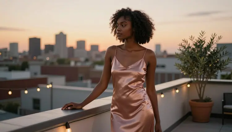
The rose gold rooftop look above is the kind of shot where color accuracy is hardest to fake: warm sunset light, a metallic fabric and skin tone all in the same narrow range. It is a fair test for any model claiming to hold a palette rather than just approximate it.
Every other model on Picasso IA can still attempt these palettes, but treat anything outside these six as untested for this kind of work: worth trying on a low stakes generation, not something to build a paid shoot around until you have confirmed it yourself.
Every palette in this guide assumes the same starting point: an adult creative platform built for adults making adult content. Picasso IA's uncensored tools are restricted to users who are 18 or older, and every subject you render here, in any palette, is a fictional adult character. Real people cannot be recreated without their consent, and nobody underage, however an outfit or setting is styled, belongs in a prompt on this platform. Uploads and generations stay private by default: nothing you create is pushed to a public feed or shared with other accounts unless you choose to export or post it yourself. Keep those three things true and every palette in this guide is fair game.
The most common failure is not a bad color choice, it is too many good ones fighting for attention. Three or four saturated hues in one frame will always read as noisy, no matter how nice each one looks alone. Pick one dominant color and let everything else support it.
The second mistake is describing the color of objects but not the color of the light hitting them. A blue dress under warm tungsten light will not look like the cool blue you pictured, it will look muddy, because the prompt never told the model what kind of light source to use. Name the light source and its color temperature alongside the wardrobe, every time.
The third mistake is a background that fights the outfit instead of supporting it. A cool palette needs a background that stays cool too, and a warm one needs the opposite, otherwise the eye keeps bouncing between two competing temperatures instead of settling on the subject.
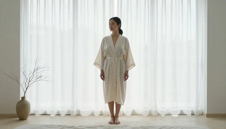
Ivory silk against bright sheer curtains above avoids all three mistakes at once: one dominant tone, light and fabric color matched to each other, and a background that supports the palette instead of competing with it. That restraint, more than any single hue, is what separates a palette that reads as intentional from one that reads as accidental.
What makes a color palette feel intimate rather than generic in AI art?
A palette feels intimate when it commits to one dominant hue and one light source instead of spreading attention across several competing colors, because a single clear choice reads as deliberate while a scattered one reads as default output nobody art directed.
Which Picasso IA model keeps skin tones accurate across a whole palette?
Seedream 4.5 and Recraft V4.1 Pro are the most consistent for lighter, softer palettes, while Qwen Image 2 holds up best under deep, saturated color where skin tone is easiest to lose, and all three are confirmed uncensored tools with no content filter getting in the way of the correction.
Can I reuse the same palette prompt across different characters and scenes?
Yes, that is the point of writing the five step block as one reusable phrase, the dominant hue, saturation ceiling, skin anchor and accent color travel with the phrase regardless of which character, outfit or setting you paste it into.
Does a bold, saturated palette feel more intense than a soft pastel one?
Generally yes, saturation and contrast read as intensity while low saturation and soft light read as calm, which is why picking the palette first and the pose second keeps the two working together instead of pulling in opposite directions.
How many reference images should I upload to keep a palette consistent?
Two or three images that already share the dominant hue and light source are usually enough, uploading references with different, conflicting palettes tends to average them out into a duller, less committed result than starting from a written prompt alone.
Is this platform limited to photorealistic palettes, or can I use painterly or anime inspired color schemes?
The same five step method works for painterly, anime and stylized color schemes as well as photoreal ones, the dominant hue and saturation ceiling still anchor the look, only the rendering style around them changes.
What is the minimum age requirement for using Picasso IA's uncensored tools?
Every uncensored tool on this platform is restricted to users who are 18 or older, and every character generated with it, in any palette, must be a fictional adult, never a real person recreated without consent and never anyone underage.
Why does my rust orange or burgundy palette sometimes turn muddy?
Muddy results almost always come from a light source color that fights the wardrobe color, describe the light and its warmth or coolness directly in the prompt instead of only describing the clothing, and the same hue will render far cleaner.
Can I combine two palettes from this list in a single generation?
You can, but treat one as dominant and the other as a small accent rather than giving both equal weight, a cobalt dominant palette with a single rose gold accent object will read as intentional where two equally strong palettes will simply cancel each other out.
Does Picasso IA store or share the images I generate with these palettes?
Generations stay private by default and are tied to your own account, nothing you create is pushed to a public feed, a gallery or another user without your own choice to export or post it.