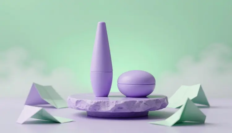
Printing packaging is the expensive way to find out that a label is too busy, a box color reads muddy, or a pouch front does not say what is inside. AI packaging design moves that discovery earlier. You describe the label, box or pouch, get realistic mockups in minutes, and compare directions on screen, so the file that finally goes to a printer has already survived a few honest rounds of looking at it.
A packaging decision is hard to reverse. Once a run of boxes is printed, a wrong color or a cramped logo is yours to keep. The usual way to avoid that is a round of flat mockups, a few printed samples, and a lot of imagining how a flat artwork will look wrapped around a curved jar. Image models cover the imagining part. You can see the same label on a bottle, a jar and a tin, in lavender, in kraft brown, in matte black, and notice which one you reach for.
Picasso IA puts 502 models behind one interface, so the same brief can go to a model that is good with words on labels and to another that is good with photographic mockups. The full catalog is open to browse. New accounts get free credits, which is enough to try a direction before you spend anything, and the cost of a generation depends on the model and the settings, so check the pricing page for the current plans instead of trusting a number written here.
No single model is best at everything on a pack. Words on a label, the shape of a box and the look of a product photo are different problems, and the catalog lets you split them. The table below is a starting point built from what each model is described as doing in the catalog, not a ranking.
| Packaging task | Model to try first | What to ask for | What to check |
|---|
| Label with a brand name and tagline | ideogram-v4-quality | The label flat, centered, on a plain background | Every letter, spacing and line breaks |
| Box or carton, large and detailed | recraft-v4-pro | A front view at about 2048px, with the palette named | Edges, folds and where panels meet |
| Pouch or bag in a lifestyle scene | nano-banana-pro | The pouch on a kitchen counter, daylight, reference attached | Whether the pouch shape stays the same across runs |
| Same design on several formats | nano-banana-pro with your label as a reference | Place this label on a jar, a bottle and a tin | Scale and proportion of the label on each |
| Shipping box or mailer | recraft-v4-pro | A kraft mailer with a one-color print, studio light | Whether the print looks realistic for a one-color job |
For the rows that use nano-banana-pro, the useful feature is reference input: the catalog lists up to 14 reference images alongside the prompt, so your own label or logo can steer the result instead of being reinvented each time. For recraft-v4-pro, the useful feature is size: the output is around 2048px, which gives you room to zoom into the corners of a box. If you want to browse alternatives by type, the collection groups every text-to-image model.
This is a workflow that ends with a folder of comparable mockups and a short list of decisions, not with a print file. It assumes you already know what the product is, what it is called and who it is for.
- Write the brief in plain words. Product, format, brand name, two or three colors, the mood, and what must appear on the front. A line such as a lavender cardboard box for a mint tea, minimal, brand name in rounded type, is a complete start.
- Generate the label first with ideogram-v4-quality. Ask for the label flat on a plain background, with the exact text in quotes, then read every character. Repeat with two or three layouts so you compare typography, not luck.
- Render the pack with recraft-v4-pro. Describe the box, jar or pouch and name the same palette, then generate a few variants at 2048px to look at edges, folds and proportions closely.
- Place the winning label in a scene with nano-banana-pro. Attach the label image as a reference and ask for it on a bottle, a box or a shelf, one change at a time, so you can tell what each edit did.
- Save the comparison and write down what you decided. Keep the best three side by side, note which color, layout and format won and why, and open the toolkit again only for the next round. Bring those notes to your printer or designer.
A packaging prompt works best when it reads like a brief to a human designer: what the product is, what the pack is made of, what the front says, and what the light is doing. Material words steer a lot. Matte cardboard, glossy foil, kraft paper, frosted glass, soft-touch plastic and uncoated stock all look different, and a model will respond to the one you name. Naming the finish is often the difference between a pack that looks like a render and one that looks like something you could pick up.
Keep the text short. A brand name and a four-word tagline will survive generation far more often than a paragraph of copy, so put the minimum on the label and leave small print for your own layout tools. If you want a pack without any words at all, say so, and add the words later where you control them.
Ask for one pack, front view, plain background first. Once the design itself is right, then ask for a scene. If you start with a scene, you judge the lighting and the props instead of the pack. Ideogram v4 also takes a structured JSON prompt in place of plain text, which is useful when you want to fix the same elements across variants.
A mockup answers one question: does this idea look right on a pack. It does not answer whether the artwork is printable. Treat every output as a concept and keep the legal text, barcode and nutrition panel for your own files.
The most common mistake is judging a design under perfect light. A pack that glows on a pale gradient may disappear on a retail shelf next to ten others, so ask for a shelf scene with busy neighbors and check whether your design still reads from two meters away.
The second is trusting the text. A model can produce a label that looks fine at a glance and has one swapped letter in the brand name. Read it aloud, letter by letter, before anyone else sees it. The same goes for the product name inside a scene: an editing model may rewrite text it was meant to keep, so compare the final image with the label you started from.
The third is changing everything at once. If you change the color, the font and the format in one prompt, you will not know which change helped. Change one thing per run. When the direction is settled, the same discipline applies to the brand itself: if you are still deciding on a mark, start with AI logo concepts, and for photographic scenes of a finished pack the AI product mockups page shows a similar flow.
A concept is not a production file, and a few parts of packaging are firmly outside what image models do. Here are the limits that matter in practice:
- Dielines: the output is a picture of a box, not a flat die-cut template with exact folds, glue tabs and bleed, so your printer or packaging designer still has to build the real structure.
- Legal text: ingredients, warnings, net weight, recycling marks and any required statements must be written, checked and placed by you, because a model can invent plausible text that is wrong.
- Barcodes: a generated barcode is only a drawing of one and will not scan, so the real code has to be added from a proper generator in your layout file.
- Nutrition panels: tables of values are the kind of structured text models garble, and the numbers have to come from your own verified data, never from a generation.
- Color accuracy: screens and printing inks do not match, so the lavender on your screen is a direction, and only a printed proof tells you what the finished color will be.
Platform and retailer requirements for labels and packaging change, so check the current requirements of wherever you sell. This page is general information about a design workflow, not packaging compliance advice, and a qualified professional should review anything regulated before it is printed.
Can AI design packaging I can send straight to a printer?
Not as it comes out. The result is a picture of a pack, which is excellent for judging color, layout and mood, but a printer needs a dieline with exact folds, bleed and safe areas, plus vector or high-resolution artwork with the legal text in place. Use the mockup to decide what to build, then have your designer or printer's prepress team make the real file from your chosen direction.
Which AI model is best for label text?
Start with ideogram-v4-quality, which is the model this page recommends for labels because the brief is mostly words on a surface. No model is perfect at text, though, so keep it short, put the exact wording in quotes, and read every letter of the result. If one model keeps garbling your name, run the same prompt through another text-to-image model in the catalog and compare.
Can I put my own logo or label on the mockup?
Yes, with a model that accepts reference images. Nano-banana-pro takes up to 14 reference images next to your prompt, so you can attach your label or logo and ask for it on a bottle, a box or a tin. Check the output against your original, because an editing model can slightly redraw details such as thin lines or small type even when you ask it to keep them.
Can I compare several colorways of the same pack?
Yes, and it is one of the best uses of the workflow. Keep the pack, the layout and the lighting fixed in the prompt and change only the palette, generating a few variants per color. Looking at lavender, mint and kraft side by side on identical boxes tells you more than describing them. Remember that screen color differs from printed ink, so a proof still matters.
How do I get a pouch or bag that looks right?
Describe the format precisely: a stand-up pouch with a zipper and a tear notch, front view, plain background. Then put it in a scene as a second step. Pouches wrinkle, and a model may change the shape between runs, so attach the first good result as a reference when you generate variations, and compare the silhouette each time.
Can AI generate the barcode and nutrition panel?
It can draw something that looks like them, but they will not be correct. A generated barcode will not scan, and a generated nutrition table can contain invented numbers. Leave those areas out of the prompt or keep them as empty blocks, then add the real barcode and the verified values in your layout software. Required statements belong to you, and a qualified professional should check them.
Is it okay to use these mockups in a pitch or on a store page?
For a pitch or an internal decision, yes, as long as you say they are concepts. For a store listing, the picture must stay truthful about the item that will arrive, so do not show a pack you cannot produce yet as if it were in stock. Check the current image requirements of the platform you sell on, since each marketplace sets its own rules.
Does it work for boxes, tubes, cans and bottles, not only labels?
It handles all of them as pictures, with different reliability. Simple volumes such as boxes, jars and cans tend to come out cleanly, while complicated structures such as multi-panel gift boxes or unusual closures are more likely to look wrong. If a shape matters, describe it plainly, generate several variants, and treat the structure as an idea your packaging engineer will confirm.
How many versions should I generate before choosing?
Enough to see the spread, which usually means three or four directions with a few variants each, not dozens. A tight cluster of similar results suggests the prompt is precise, while a scattered one means the brief needs another sentence. Once one direction clearly wins, spend the rest of the effort on refining that single design instead of starting new ones.
How much does it cost to test a packaging design?
Generations are paid in credits, and the cost per image depends on the model and the settings you choose, so a number written here would go out of date. New accounts start with free credits, and the current plans are listed on the pricing page. Higher resolution and heavier models cost more, so draft with a lighter one and save the best model for the final mockups.
Have a pack in mind that you keep describing instead of seeing? Open the Picasso IA toolkit and put the first label on a box today.