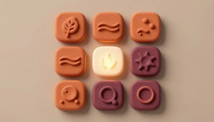
Most app icons fail for a boring reason: they were drawn one at a time, on different days, and it shows. The launcher tile has rounded gradients, the tab bar glyphs are thin outlines, and the empty state uses a third style nobody chose. An AI icon workflow fixes that by letting you define the look once and generate the whole set against it, in a single session.
A single icon is easy. A set is hard, because consistency is the whole point: the same stroke weight, the same corner radius, the same palette, the same level of detail. Designers know this, and it is why icon sets are usually bought or built over weeks. Text-to-image and text-to-vector models are good at the first icon and unreliable at the fifth, unless you give them something to hold on to.
That something is a style sheet written in words, plus a reference image once you have a winner. With both, you can ask for twelve glyphs in one sitting and compare them side by side instead of trusting memory. If you are a solo developer or a small team with no designer on call, that is the difference between shipping placeholder icons and shipping icons that look chosen.
Picasso IA puts 502 models behind one interface, and 212 of them are text-to-image, so you can pair a vector model for clean paths with an image model for glossy tile art without changing tools. The full catalog shows what else is available, and the vector graphics and SVG icons page goes deeper on the SVG side alone.
Before generating anything, write four or five lines that every icon prompt will start with. This is your style sheet, and it does more for consistency than any model choice. Cover the shape language, the line or fill treatment, the palette, the background and the level of detail.
For example: flat glyph, rounded outline look with one even stroke weight, one plum color on a transparent background, no gradients, no text, centered with generous padding. Paste those lines at the top of every prompt, then add only the subject: a calendar, a chat bubble, a shopping bag. When one icon drifts, you can see exactly which line it ignored, and fix that line instead of rewriting everything.
Keep the subject nouns concrete and boring. A model draws a bag better than it draws the idea of commerce. If the concept is abstract, such as sync or privacy, describe the object that carries it: two arrows around a cloud, a padlock on a shield. Then, once you have a few winners, attach the best one as a reference image so the next batch inherits its weight and corners.
Not every icon in an app needs the same tool. The launcher icon is a piece of artwork; the settings gear is a symbol. Match the model to the job:
| Approach | Model to try | Output | Best for | Watch out for |
|---|
| Text to vector | recraft-v4.1-svg | SVG with editable paths | Flat or outline glyphs inside the app | Fine texture and soft lighting come out simplified |
| Premium vector pass | recraft-v4.1-pro-svg | SVG with editable paths | The one or two marks that carry the brand | Compare against the standard model before you commit credits |
| Raster from a reference | nano-banana-pro | PNG or JPG, up to 4K | Glossy or 3D launcher tile art, matched to your logo image | Pixels, not paths, so you cannot edit the shapes |
| Trace a raster | recraft-vectorize | SVG traced from an image | Turning a raster you like into paths | Tracing copies the picture, flaws included |
| Clean cutout | bria/remove-background | Image with transparent background | Isolating an icon that came with a backdrop | Check the edges at the size you will actually ship |
A sensible split for most apps: vector models for the glyph set, an image model for the launcher tile, and a trace or cutout pass only when you need it. The AI logo concepts page covers the step before this one, finding the mark itself.
This is the loop that ends with a folder of matching files instead of a pile of near misses. It assumes you already have a brand color and a rough idea of what the app does.
- Write the style sheet and the icon list. Five lines of style, then a plain list of every icon the app needs, from the launcher tile to the empty states, so you generate against a checklist.
- Generate the first glyphs in a vector model. Open the toolkit, pick recraft-v4.1-svg, paste the style sheet plus one subject, and make a few variants per icon. Read them side by side, not one by one.
- Lock a reference and repeat. Choose the icon that best shows your style, then attach it as a reference in nano-banana-pro, or keep prompting the vector model with the same style lines, and generate the rest of the list.
- Build the launcher tile separately. Treat it as artwork: ask for one bold symbol on a plain field, using your logo image as a reference, and try a few treatments before choosing.
- Test at real size and export. Shrink every icon to the size it will appear at on a phone, throw out the ones that turn to mush, and download the SVG files plus the raster tile at the largest size offered.
The reason to prefer SVG output for in-app icons is not fashion, it is maintenance. A path file can be recolored for dark mode, nudged a pixel, resized for a tablet layout or exported to the formats your build tools want, with no quality loss. A flattened PNG can only be redrawn. So keep the SVG as the master file and treat any PNG as an export you can regenerate.
Store requirements are a moving target. Icon sizes, whether transparency or rounded corners are allowed, safe areas and file formats have all changed over the years and differ between the Apple App Store, Google Play and every other store. Do not trust a number you read on a blog, including this one. Open the current developer documentation for each store you ship to, note the exact sizes and rules, and export to those. The generated art is the starting point; the store checklist is the final gate.
Tip: draw the launcher icon without any rounded corners and without text. Stores apply their own masks and shapes, so a full-bleed square with one centered symbol survives whatever mask is applied, and a tiny word never will.
One more habit helps: keep a plain text file with the prompts and the reference image behind the final set. In six months, when you add a fourteenth icon, you will be glad the style sheet still exists.
This works well for a first full set and for filling gaps, and it stops being useful in a few specific places:
- Pixel-perfect small sizes: a model does not snap strokes to a pixel grid, so tiny tab bar icons often need a designer's hand to align them at 16 or 24 pixels.
- Exact brand geometry: if your logo has a precise curve or a registered shape, a model will approximate it, so rebuild the mark in your vector editor and use the generated art around it.
- Identical sets on the second run: tomorrow's batch will not match today's unless you reuse the same style lines and reference image, because the model has no memory of your last session.
- Gradients and glow in vectors: SVG output favors flat shapes, so rich lighting belongs in the raster launcher tile, not in the glyph set.
- Existing marks: never ask for a lookalike of another company's icon or logo; it is a legal risk and an easy way to get your app rejected.
None of this means skipping the tool. It means using it for the exploration and the consistency, and spending your designer's time on the last stretch of alignment.
Can AI generate an app icon for iOS and Android?
Yes, as artwork. You can generate the launcher symbol as a vector or as a high resolution image and export it at the largest size offered. What the model cannot do is know the current store rules, so after generating, check the Apple and Google developer documentation for the exact sizes, formats and mask behavior, then resize and export to match.
Which model is best for app icons?
It depends on the job. For in-app glyphs and anything you want to edit later, recraft-v4.1-svg returns SVG with editable paths. For a polished launcher tile that follows your logo image, nano-banana-pro accepts reference images and renders up to 4K. Running the same prompt through two models is cheap, and the catalog of 502 models makes that easy.
Can I get editable vector icons instead of PNG files?
Yes. recraft-v4.1-svg and its pro variant output SVG files with structured paths that open in any vector editor, where you can recolor, resize or rearrange the shapes. If you only have a raster you like, recraft-vectorize can trace it into paths, though tracing copies whatever is in the picture, including soft edges and mistakes.
How do I make every icon in the set look the same?
Write a style sheet of four or five lines covering shape, stroke or fill, palette, background and detail, and paste it at the top of every prompt. Once one icon looks right, attach it as a reference image for the rest. Without those two anchors, each generation is a fresh interpretation and the set will drift.
What size should an app icon be?
There is no single answer, and the numbers change between stores and over time, so any figure written here could be out of date. Check the current developer documentation for each store you submit to, note the required sizes and formats, and export to that list. Generate at the highest size available, since shrinking is safe and enlarging is not.
Can I add text to an app icon with AI?
You can try, but it is usually a bad idea. Models are unreliable with letters, and even a perfect word becomes unreadable at the size an icon appears on a phone. Many store guidelines also discourage text in icons, so check the current rules. A single bold symbol or a stylized initial from your logo works far better.
Can I use AI icons commercially in my app?
Generally you can use outputs from your own prompts in your own product, but the legal picture for machine-made images is still settling and varies by country. Do not imitate another brand's icon, avoid prompts that name real companies, and consider having a lawyer review anything that carries your core brand. This is general information, not legal advice.
How do I make a dark mode or monochrome version of the icons?
Start from the SVG files. Because the paths are editable, you can swap colors, remove fills for a monochrome variant, or recolor against a dark background without redrawing anything. If you only have raster icons, generate the variant again with the same style lines and a changed palette, or run a cutout pass and recolor in your editor.
Can AI redesign my existing app icon?
Yes, as a way to explore. Upload your current icon as a reference to nano-banana-pro and ask for variations in a new style, a flatter treatment or a different palette. Keep what you like as inspiration, then rebuild the final version in your vector editor so the geometry is exact and the file is yours to maintain.
How much does it cost to generate an icon set?
Generations use credits, and the cost depends on the model and the settings you pick, so no fixed number would stay correct for long. Simple images sit at the lower end of the catalog. New accounts get free credits to try a first set, and the pricing page is the only place to trust for current plan details.
Ready to see your own brand as a set? Open the Picasso IA toolkit, write the style sheet, and generate the first row of icons.