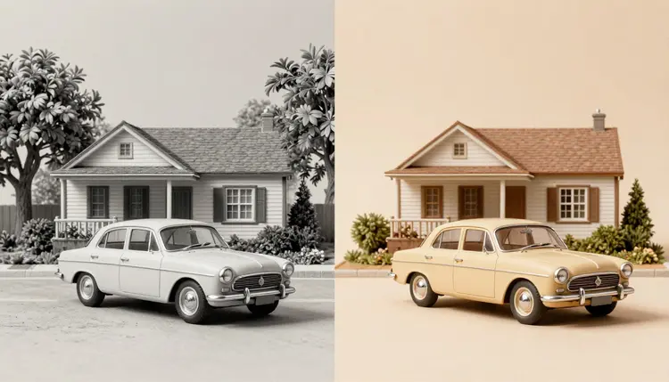
A black-and-white photo hides its colors, it does not lack them. Someone was wearing an actual blue coat and standing on actual green grass the day that shutter clicked, and a colorization model's job is to make a believable guess at what that color was from shading, texture and context alone. It will never be certain, but on a family portrait or an old street scene it is usually close enough to make the photo feel present again instead of historical.
Manual colorization used to mean hours in a layers panel, painting selections by hand and hoping the skin tone matched across every frame. A dedicated colorization model collapses that into one upload and a saturation slider, because the model was trained specifically to read grayscale value, infer plausible hue from texture and context, and paint the whole frame in one pass instead of region by region.
Picasso IA runs topazlabs/image-colorization for exactly this job: drop in a grayscale or faded image and it returns a colorized version in seconds, with a saturation control from subtle, natural tones up to rich, vivid color. For a photo that also needs scratches, creases or fading repaired before or alongside colorizing, flux-kontext-apps/restore-image handles damage repair and colorization together in one pass. Both live in the same 488-model catalog as the rest of the Toolkit, so the same account covers colorizing, restoring and upscaling without switching tools.
Saturation is the one control that shapes how a colorized photo reads, and pushing it too high is the most common mistake. A low value keeps skin tones muted and fabric colors soft, which tends to look closer to how period color film actually rendered a scene. A high value produces punchier, more modern-looking color that can feel artificial on a photo from the 1940s or 1950s, where nobody's coat was ever that saturated a red.
| Saturation | What it looks like | Best for |
|---|
| 0.1 to 0.2 | Muted, film-like tones close to the original grayscale values | Formal portraits, archival scans |
| 0.3 to 0.4 | Balanced, natural color with visible but calm hues | Family snapshots, everyday scenes |
| 0.5 to 0.6 | Noticeably richer color, still plausible | Outdoor and nature photos, foliage-heavy scenes |
| 0.7 and up | Vivid, saturated color that reads as a modern edit | Social posts and creative reinterpretations, not archival use |
| Mixed pass | Run a low and a high value and compare side by side | Any photo where you are unsure which suits it |
There is no single correct setting, since the right value depends on the photo and what you plan to do with the result. Running the same image at two saturation levels costs seconds and settles the question faster than guessing.
- Start low: a muted first pass at low saturation is easier to judge for accuracy than a vivid one, and it is simpler to add richness afterward than to tone down an overcooked result.
- Scan flat and evenly lit: the model reads texture and shading to infer color, so a glare spot or an angled scan hides the very information it needs to make a good guess.
- Keep the black-and-white version: the added color is an interpretation, not a fact recovered from the photo, and keeping both makes that distinction visible later.
- Judge skin tones first: they are the detail viewers notice fastest and the one a colorization model gets right most consistently, so a portrait that looks off there is worth a second pass.
- Treat uniforms and flags with caution: specific colors tied to a known uniform, flag or logo are exactly the kind of detail a model can get plausibly wrong, so verify those against another source.
This walkthrough assumes a single photo, whether that is a phone photo of a printed picture or a scanned negative, and takes a few minutes from upload to a downloadable result.
- Get a clean scan or photo first. Lay the print flat, light it evenly from two sides so no glare crosses a face, and fill the frame without cropping detail you might want later.
- Open topazlabs/image-colorization in the Toolkit. Upload the grayscale or faded image and set saturation to a low value like 0.2 for a first, conservative pass.
- Compare a second pass at a higher saturation. Run the same upload again at 0.4 or 0.5 and place both results side by side to see which reads as more natural for that specific photo.
- Repair damage separately if the print needs it. If the original also has scratches, creases or heavy fading, run flux-kontext-apps/restore-image, which handles color and physical damage together, and compare it against the colorization-only pass.
- Download the version you trust and keep the original. Save the colorized result alongside the untouched grayscale scan, since the black-and-white file remains the more reliable record if anyone later needs to check a detail.
Colorizing and restoring get talked about as one task, but they solve different problems. Restoring recovers detail the photo already recorded: contrast washed out by fading, edges softened by scratches, a color cast left by decades in a drawer. Colorizing adds information a black-and-white photo never captured in the first place, since a monochrome negative never recorded what color anything actually was.
That difference matters for how much to trust the result. A restoration is closer to a correction, most of what changes was genuinely there in the print. A colorization is closer to an illustration built on top of real shading and texture, which is why it is worth keeping both versions and treating the colorized one as an interpretation rather than a document.
Colorizing tells you what a scene plausibly looked like, not what it definitely looked like, and that distinction matters most for anything you plan to treat as a record rather than a keepsake.
For a photo with both problems, damage and no color, old photo restoration is the deeper look at fixing scratches, creases and fading on their own, and flux-kontext-apps/restore-image is built to run both jobs together when a print needs the full treatment in one pass.
A colorization model is genuinely good at reading shading and texture, and genuinely limited by what a grayscale photo cannot tell it. Worth knowing before you rely on a result:
Skin tones and common materials like grass, sky and wood come back convincing most of the time, because the model has seen enormous numbers of examples of what those look like in color. Specific, uncommon or historically significant colors are a different story. A model has no way to know a particular car was painted a custom color, that a specific dress was a shade the family still argues about, or that a flag pattern from a given decade used a color no longer common. It will paint something plausible in that spot, and plausible is not the same as correct.
Very old or heavily faded photos with little tonal range left also give the model less to work with, and the colorized result can look flatter or less confident than a well-exposed scan produces. Group photos with many small faces sometimes get slightly inconsistent skin tones between people, since each face is colored somewhat independently. None of this makes the tool unreliable for its actual purpose, adding a natural, plausible color pass to a photo that never had one, but it does mean a colorized photo intended for a museum caption, a legal record or a fact-sensitive publication needs a human who can verify details the model is only guessing at.
Is AI photo colorization accurate to the real, original colors?
Not verifiably. A colorization model infers plausible color from grayscale shading and texture, but a black-and-white photo never recorded what color anything actually was, so there is no way to confirm the result against the original scene. Skin tones and common materials tend to come back close to right, while specific or unusual colors are closer to an educated guess. Treat the result as a believable interpretation, not a documented fact, and keep the original black-and-white file as the reference copy.
Can I colorize an old photo for free?
Picasso IA gives new accounts free credits, and colorizing a single photo is one of the cheaper things to spend them on, since it is one image rather than a video or 3D generation. That is enough to test a photo or two and see whether the result works for what you need. Paid plans and current pricing are listed on the pricing page, since specific numbers here would go stale.
What is the difference between colorizing and restoring an old photo?
Colorizing adds color a black-and-white photo never captured. Restoring recovers detail the photo already has but that damage, fading or scratches obscured. They are separate jobs with separate honesty standards: a restoration mostly recovers what was really there, while a colorization is an informed guess layered on top of real shading. Many old prints benefit from both, and old photo restoration covers the repair side in more depth.
Which Picasso IA model should I use to colorize a photo?
topazlabs/image-colorization is built specifically for colorizing a clean grayscale or faded image, with a saturation slider to control how vivid the result looks. If the original photo also has scratches, tears or heavy fading that needs fixing, flux-kontext-apps/restore-image handles damage repair and colorization together in a single pass, which saves a step when a print needs both.
Can I control how vivid or muted the colorized photo looks?
Yes, through the saturation setting. A low value between 0.1 and 0.2 produces muted, film-like tones that tend to suit formal portraits and archival scans, while a higher value from 0.5 upward produces punchier, more modern-looking color. Running the same photo at two saturation levels and comparing them side by side is the fastest way to find what suits a specific image.
Will colorizing damage or alter the original photo file?
No. The model reads the image you upload and generates a new colorized version; nothing happens to your original file unless you choose to overwrite it yourself. Keeping the black-and-white original alongside every colorized version is good practice anyway, since the grayscale file stays the more reliable record if a detail is ever in question later.
Can AI colorize very old or badly faded photos?
Often, but the result depends on how much tonal detail the original still holds. A photo with visible gray-scale gradation, real shading across faces and objects, gives the model enough information to work from. A photo that has faded to a nearly flat gray, with almost no contrast left, gives it very little to infer from, and the colorized result can look muted or uncertain in those areas no matter what saturation you choose.
Does colorization work on group photos with many people?
Yes, though results can vary slightly between faces in a crowded frame, since each face is colored somewhat independently based on its own shading. For a large family or class photo, it is worth reviewing skin tones across the group after a first pass, and running the image again if a particular face looks noticeably different from its neighbors.
Can I colorize a scanned negative instead of a printed photo?
Yes, as long as the negative has been scanned or inverted into a normal positive grayscale image first, since the colorization model expects a standard photo, not a negative. Most flatbed scanners and phone scanning apps handle that inversion automatically. Once you have a clean positive scan, feed it into the colorization model the same way you would a printed photo.
How much does it cost to colorize a photo on Picasso IA?
Generations are paid in credits, and the exact cost depends on the model and settings you choose, so a specific number here would be wrong within a month. Colorizing a single image sits at the cheap end of the catalog compared to video or 3D generation. New accounts start with free credits, and current plan pricing lives on the pricing page, which is the only place worth trusting for numbers.
A photo that has sat in a drawer in grayscale for decades does not need to stay that way. Open the Picasso IA toolkit and give it a first colorized pass in the next few minutes, then decide from there whether it also needs its damage repaired.